Defining skills is a tough job. But if you can't define them, you can't connect them to your content efficiently – and your people can't build them. So we decided to start a new series, the Skills Spotlight, in which we'll take an in-depth look at a different skill each month based on the insights generated by our Content Intelligence tech and skills framework projects with our clients.
In this first instalment, we're turning the spotlight on data visualisation, a common priority for clients looking to extend the value of data analysis to the business end of their business model.
As this is the first of the series, we'll explain a little of our thinking on skills as we go.
Skill definition
This is our working definition of the skill from our Skills Palette:
- Data visualisation ✅ Using charts and graphics to communicate characteristics of data sets and the business insights they underpin.
The green tick (✅) means the tagging model for the skill has been carefully validated by our curation team - it can be used to tag assets in CI with confidence.
As you can see, our philosophy is to keep things simple. Definitions can be hard to write well, difficult to agree and impossible to maintain; our experience is that perfection is the enemy of great for most organisations. The task of creating and planning the maintenance of a taxonomy is either so forbidding it is never started, or a Sisyphean project for a doughty but unthanked learning team.
Our simple Skills Palette definitions often form the starting point for definitions agreed with clients in content intelligence - where the definitions quickly become organic and self-maintaining, re-defined and refined through example content, judged relevant (or not relevant) to the skill by experts and learners.
Adjacent skills
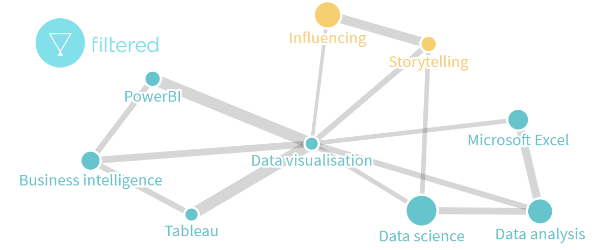
Another way of improving the definition of skills is through their relationship to other skills. We use asset libraries to deduce correlations between skills; this can be a useful tool in spotting gaps or overlaps and in suggesting content associations, for example when building playlists. Running this exercise for Data visualisation suggests some expected associations within our Data skills group, but also opens a connection into Communication and collaboration skills via Influencing and Storytelling.
Unpacking data visualisation for the organisation
Of course, visualisation is a key skill for analysts, selling their work to the rest of the business, making it accessible and applicable to their stakeholders. But also awareness of the potential of great data visualisation amongst sales agents, marketeers and leaders can create a healthy 'pull' for the skill and motivate managers to ensure its development.
Unpacking some of the above illustrates the different demands on the skill from different parts of the business - e.g. widespread raised awareness of what's possible so opportunities are seized and standards are high; leaders and decision makers having sufficient technical grasp of the skill to evaluate the business case for data visualisation skill-building and projects (and with the motivation to drive them forward); and practitioners of every level needing to see a fast and obvious return on time spent learning.
Organisations use different frameworks in considering these different dimensions of skill-building, where they think about them explicitly: "discuss / do / decide" or "knowledge / decision making / execution" for example. Below we cut things according to "motivation / awareness / proficiency / expertise", which is a slightly different slant focusing on the effect on the learner. Whatever the framework, or none, it's important to understand the variety of work a skill needs to do when thinking about curation.
Like many data and digital skills, data visualisation can have a software focus. What I need to know might be specific to, or at least feel more relevant with reference to, Tableau, Power BI or Excel. To take this into account we employ two approaches depending on the context: we nuance the definition (and our tagging models to allow the focus) to reflect the software tool; or we just apply multiple tags, so curators or learners can filter by Tableau, MS Excel etc.
Content and content sources
This is our selection of great content examples surfaced by Content Intelligence that supports data visualisation capability - whether that's for leaders, generalists, specialists or customers of data viz.
Motivation
With their focus on senior leaders, strategy consulting firms like McKinsey generate resources that motivate capability development: grounding the case for building skills in an analysis of trends and the opportunities and threats they herald. This example looks at the link between investment in analytics and high performance:
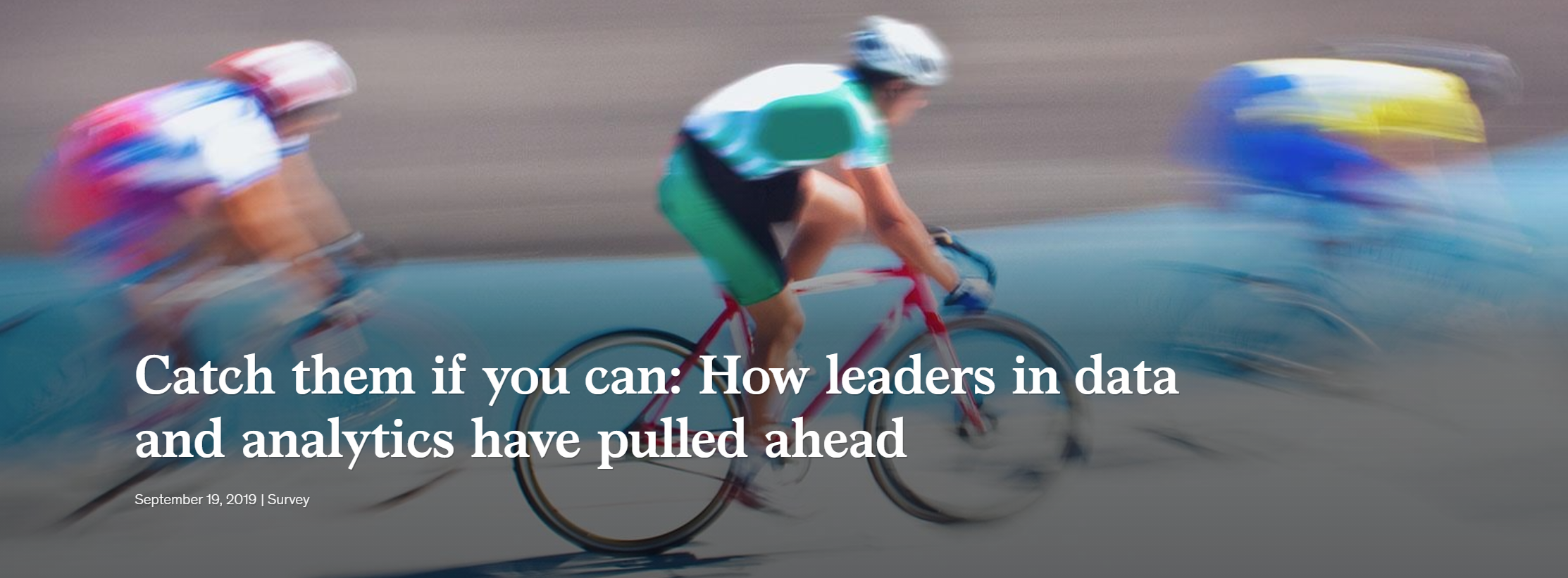
Assets like this help arm managers with the information they need to prioritise appropriately and drive key capability improvements.
For the learner, jobs boards publish rich analysis on the link between skills and employability, as do professional bodies or sites dedicated to practitioners: Data Science Central is an example that frequently covers demand for data visualisation skills. And think tanks such as The World Economic Forum identify the skills that will drive employee value in the longer term.
Awareness
Article-format libraries such as Harvard Business Review are the obvious source of awareness-level resources, and their content extends well beyond leadership to awareness of technology and trends, including in data visualisation.
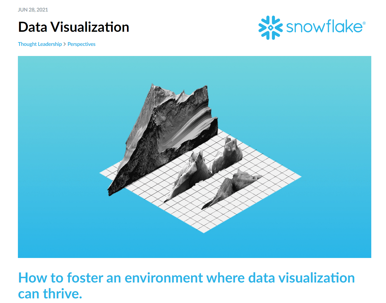
Awareness-focused content also supports decision making and leadership. Vendors of data products and platforms produce high quality content to market their services - with careful curation these can supply useful learning assets. This example from analytics-optimised data warehouse Snowflake gives pointers for managers looking to support data visualisation skills development:
Proficiency
Unsurprisingly, Coursera is extremely strong on upskilling content for data visualisation practitioners. Our Content Intelligence analysis identifies a whopping 8% of Coursera's 5000-strong course library as relevant to the Data visualisation skill. There's a course here for every technology stack, for example Data Visualization in R with ggplot2 from Johns Hopkins.
Tech vendors often also provide deeper content aimed at building proficiency in executing the skill, in the form of articles, blogs, courses and communities. With the right contextualisation for your business these can be prove very relevant and effective, aligned with your tech stack and naturally definitive in the usage of the tech. For example Tableau provide free training videos and proficiency-focused articles such as this example illustrating how to use animation in a visualisation judiciously and purposefully.
And of course, the big paid libraries like Percipio and Linkedin Learning's bread and butter are proficiency-building courses, from video-based courses that take a couple of hours to complete like this LinkedIn Learning course aimed at already proficient analysts, to deeper, boot-camp style content that can jump-start a beginner like this digital bootcamp from SkillSoft on data storytelling.
Expertise
Experts in a skill are more likely to spend time understanding what their peers are up to, or keeping abreast of novel ideas, than topping up proficiency with formal courses. For these learners examples of best practice become a learning resource. In data validation, Nate Silver's data journalism site FiveThirtyEight continues to break new ground in terms of visualisation design and also analyses its own work from time to time. The Economist's Daily Charts are another source of design inspiration.
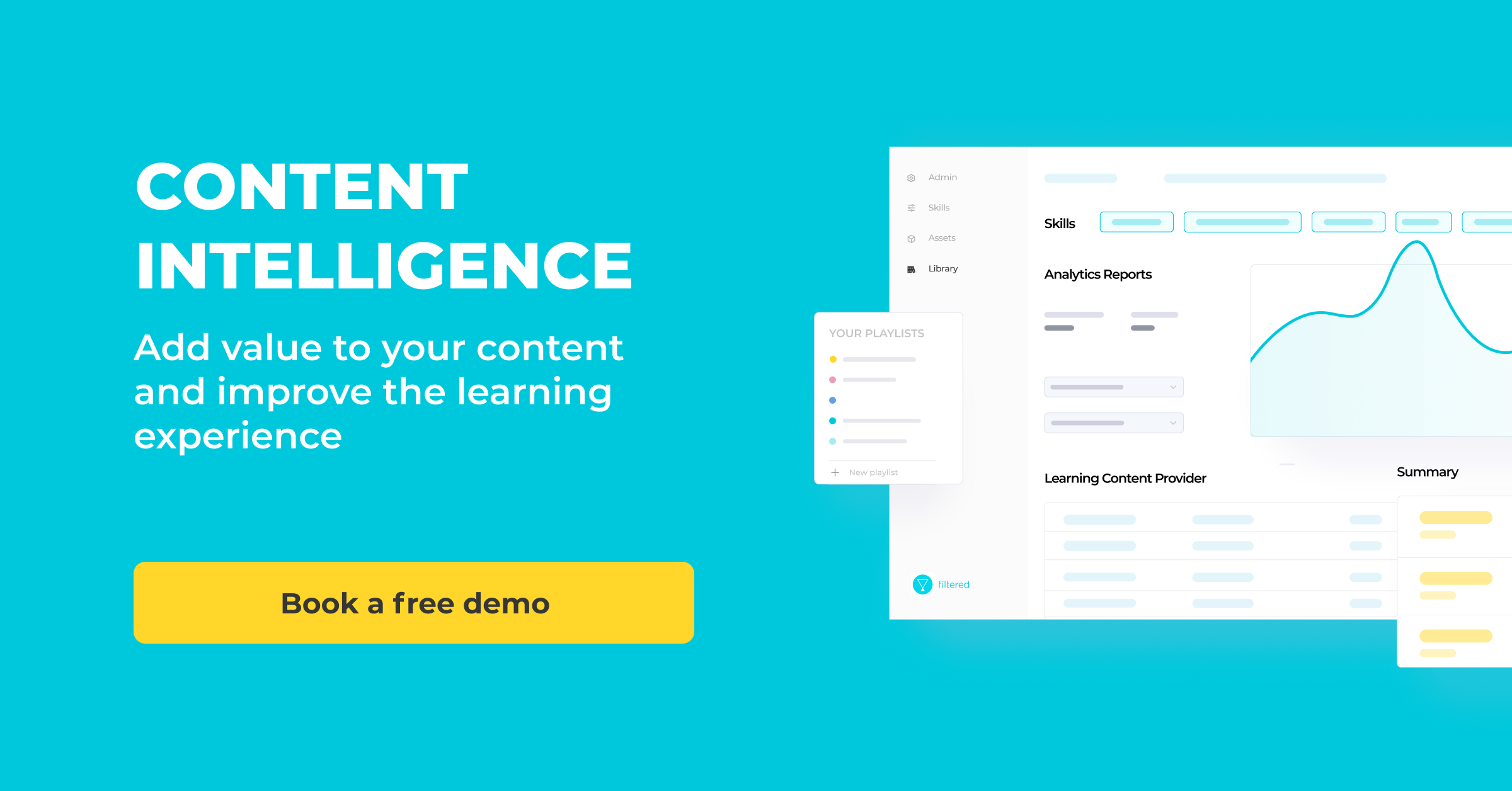
Content Intelligence
Overall, you can see how building a nuanced picture of a skill and its meaning to your specific organisation can uncover much richer, more relevant content from across the web, not just specific libraries.
And this is just for one skill. Imagine running this kind of analysis at scale, across your entire skills framework (or using our Skills Palette). That's what Content Intelligence can do. Get in touch to run a free sample analysis of some of your skills, or try a quick benchmark with our tool below.