Information overload is here to stay.
The amount of content being added (and consumed) online in a single second is staggering. See it for yourself.
Suffice to say, we have an information overload problem.
And this excessive amount of information can create massive challenges for Learning & Development (L&D) teams. Not easy, but not impossible.
So what is the best way to take that ridiculously large collection of resources and ensure the most appropriate content gets consumed at the right time by the right people?
Content curation.
This article will explore how the emerging role of a content curator is the much-needed antidote to teams built by people who are great at design but not so great at information management. Curators bridge the gap between narrative design and system organisation.
Let’s start by exploring the challenges of going from a single piece of content up to 100.
Up to 100 pieces of learning content? Hard, but manageable.
Let’s start easy, simple.
You have one thing for a user to do. One piece of content to consume/download/read.
EASY.
You just need a “DOWNLOAD NOW” (or “Get your results”) button. That’s your call to action. It’s pretty clear the next appropriate steps for the user. Click the button. Get the content.
The L&D pro with good experience in designing narratives for digital courses knows what to do with a call to action here. Drop in a button and sit back as the clicks and downloads pile up.
But what if you have 10 pieces of content? 10 items for a user to choose from …
Still easy — simple stuff for the L&D pro with experience in designing narrative experiences. Whether the content is on a desktop or mobile device, it can be effectively organised:
As seen above, an often-used model for 10-ish pieces of content is to put them into easy-to-digest chapters — step users through each learning asset in a logical order.
100 items are where the real challenge begins.
100 is about the number of main pages that most corporate intranets have. Unfortunately, 100 is a tricky number — hardly enough resources to give useful, valid search results ... yet a messy pile of information overload when presented as a list.
All sorts of design challenges arise. Internal corporate learning teams struggle to get this one right. The answer is either really good filters or an upfront survey/sequence of questions to filter those choices back down to 10 again.
And if you think 100 is a tough number to deal with, wait till the number of learning materials reaches 1,000 or 10,000 or 100,000+ (insert head explosion gif).
How to navigate 1,000 (or 100,000+) pieces of learning content
1.10. 100.
Those are manageable numbers when it comes to learning content assets.
But what about 1,000 or 100,000+? This is a fundamental task L&D professionals face as a regular part of their day. The skillset and experience required to effectively present 10s or 100s of thousands of pieces of learning content are quite different.
Designing an effective way to navigate this amount can be a real balancing act.
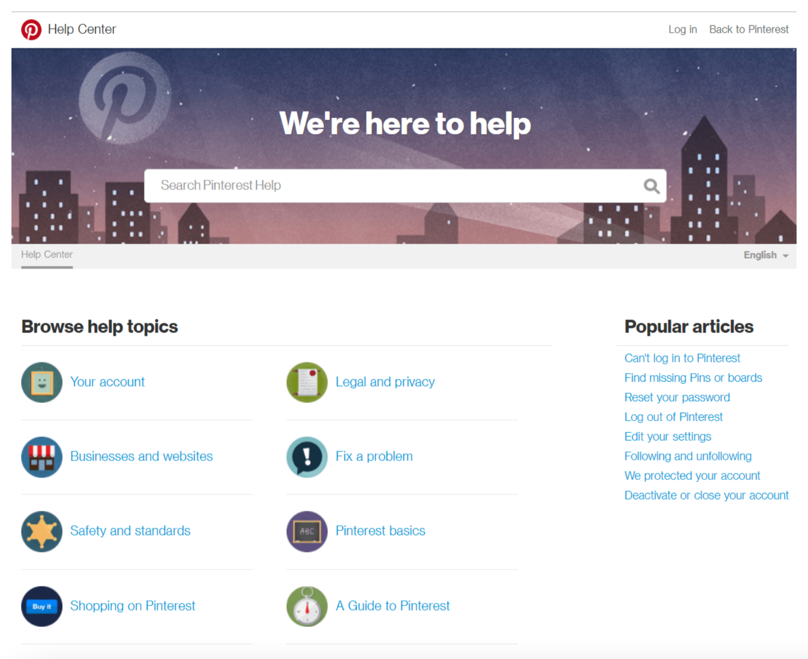
One option, that seems to be implemented the most often: Focus on the page design. Make it approachable. Word it in plain English. Ensure it's device agnostic and accessible. Slap a nice-looking search box in the middle of the screen and then summarise the key categories.
Voila!

Yet this solution is not as easy as it seems.
It can work for a help center like the one above. A well-used FAQ can identify help categories because the context is clear.
When it comes to online learning, not so much. The context (and therefore the content) is likely different for every user. So you need an L&D librarian, a specialist in the myriad problems of indexing and organising information.
In the early days of L&D, we relied on dedicated knowledge managers to do this. Now we have a bunch of “AI-powered search engines” that are not as effective as we’d hoped. This leaves the problem to be solved by front-end web designers.
A big ask.
Luckily, there is a solution.
Content curation and ants (and ant hills)
Yes. Ants. Ant hills. Content curators.
Stick with me.
The emerging role of a curator is the answer for excellent designers, but not-so-amazing information management people. Content curators can fill the hole that exists between narrative design and system organisation.
Content is a mound of dirt (sorry, content). Curators are the ants (sorry, not sorry, curators).
Curators (ants) make a home in the content (mound of dirt) that other ants can use — the ant colony below the surface and the ant hill above ground.
Still with me?
In a non-ant/ant hill/mound of dirt world, curators take learning discovery problems (i.e., a request comes in from the business: what is the best route through our content for an introduction to systems thinking?) and solve them with curation.
Like paths in an ant colony, the frequent user requests get revisited and become more optimised over time as more data gets captured and analysed. Like air vents in an ant colony, some paths are strategically important — mandated by the C-suite. These requests get implemented immediately.
The better you get at curation, and the more of it you do, the more you scale it up and systematise it, the more your categories and menus match with what people actually need, and the better the content is when they click them.
Can AI help? Of course. Especially when we are talking about 100,000+ pieces of content.
But this is also true: No AI will automagically organise your learning content without human effort. Curation is the way that L&D pros can apply sense-making force to the problem of information overload in L&D platforms.
Content Intelligence. The answer to all of the above.
Spend better. Curate faster. Enhance your LXP.
Our content intelligence platform does all three. It helps create evidence-informed, appropriate definitions of skills that can help you save about 30% of your spending on learning content, programmes, and systems.
Sure, buying your LXP is the first, necessary step to tackling information overload. But, initially, it can also seem to add to the problem.
But don’t be fooled — dropping all that content in one place is the first step to building or buying the curation capability that creates your brilliantly designed ant hill.
Filtered can help get you there. Learn how.

