In the outside world, user experience reigns supreme: 88% of online consumers are less likely to return to a site after a bad experience; 79% of visitors will leave a site and search again if content isn’t optimised. But the benefits of good user experience can be plentiful. ESPN.com revenues jumped 35% after they redesigned a user-aligned homepage. And, at the heart of it, Google’s success was built on getting users fast, relevant results.
In the learning world, user experience is just as important, but it’s not paid as much attention. Compliance training is the notable exception, simply because it can be pretty unfriendly, but people still have to use it. Autonomous learning, however, has to take up valuable work time, time that could be spent on that pressing deadline. It’s already a sacrifice. So, L&D has to work that much harder to make it worth it.
It’s not a one-off task that can simply be ticked off and suddenly your users have ‘good user experience’. If there’s a key word to aim for it’s 'optimisation'. And to hit that, learning needs to throw the kitchen sink at users (but in a user friendly way). It needs to think outside the box to get learners in it.
.png?width=150&name=The%20ultimate%20upskilling%20cheat%20sheet%202021).png)
Make your learning irresistible.
Get our upskilling cheat sheet to learn how to succeed in upskilling your workforce.
So, here are some tips you might not have considered that can help make your learning irresistible.
1. Prevent F-Pattern scanning
Scanning: the reading process of selectively skimming through text looking for specific information.
It’s how 79% of people consume content online (that number is even higher for things like newsletters). So learning is missing a trick by not optimising content and messaging for how people are actually reading it.
Luckily there’s a science to scanning that learning can leverage. Research tracking people’s eye movements has found 4 main types of reading:
F-Pattern
This is the most well known pattern, and the least desirable. It happens when there’s little structure: no bullets, subheadings, or highlighted sections. In the absence of these, people look for important bits at the start and the top: the top of sections and the beginnings of paragraphs. When mapped out, this looks like an F.
Without direction, this is where they assume the most important information will be. But it’s often not, and users miss things. The location of top and start will also differ by device and instance, leaving the key takeaways up to chance.
Spotted pattern
Not much better than the F-pattern. In this, users pick out words or chunks. Sometimes because the words that stand out to them, sometimes because they spot a word relevant to the task they want to complete, sometimes completely at random.
Again, this way of reading leaves key takeaways either up to chance or a learner’s split-second decision.
Layer-cake pattern
This pattern is the best for scanning. Like F-pattern scanning, the reader fixates on particular sections they see as important. Unlike F-pattern scanning, this is directed by structure: headings and subheadings, grouped and highlighted sections.
The reader scans down these structurally significant bits and, when they find one relevant to them, they stop and read the text around it in detail.
The user consumes the text in layers of reading, empowered to choose where to delve deeper thanks to clear structuring. Hence layer-cake (or lasagne, it’s not in the dictionary.)
Commitment pattern
When a user fully reads every word. There’s only so far user experience can help this. To get this level of reading content needs to be really engaging or really relevant.
Getting the right pattern
There’s a few tips you can use to steer readers away from the F-Pattern and towards better ones. And the techniques can improve more than learning content. People scan everything - emails, messages, instructions, platforms - because content overload is everywhere. The whole ecosystem can improve experience by being more scannable.
Of course, the dream is getting commitment pattern reading. But that’s down to the content - and making sure learning content is relevant and high quality is a different challenge.
And, anyway, people don’t always have the time. Sometimes scanning is the best option. If that’s the case, there are some quick tips to effectively guide the scan.
- The most important information should be in the first 2 paragraphs
- The content should be filled with big, visible headings and subheadings
- Related content should be grouped together visually (i.e. in a list)
- Important words and phrases should be in bold, not unimportant ones
- Links should be on information bearing words
Inspire better work and align individual career growth with organisational strategy in real-time with our LXP.
See it in action here.
2. Design for different devices
This won’t be something “you haven’t thought of”. But, its impact is often underestimated.
Some more stats: 40% of mobile users click off a site if it doesn’t load within 3 seconds; up to 57% of all online traffic occurs on mobile devices and tablets; and Mobile users are five times more likely to abandon a task if your website is not optimized for their device.
Having a mobile app for learning isn’t enough. It needs to be as good, if not better, on mobile as on laptop. Entire consultancies exist to optimise this, and new ways of working will further complicate the issue.
However, some good rules of thumb are: no flash (it’s a dying format), no pop ups (far more difficult to get rid of on mobile), and accessible design - for the “fat thumb”.
Beyond this, do what most learning departments don’t and consider mobile as of equal importance to desktop. By making the pages fit, the images load, and the buttons reachable on mobile, you’ll double the opportunity for learning experiences on your platform.
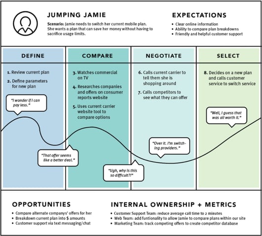
3. Journey mapping
Journey mapping: a journey map is a visualization of the process that a person goes through in order to accomplish a goal.
Generally, this is used for customers. Marketing departments lay out how a user gets through a buying process so that they can pre-empt needs.
 Learning can steal this (and other marketing tactics) and boost user experience by working out the processes by which learners use a particular platform or take part in an initiative. This is especially effective with onboarding.
Data is the key to matching your impression of your user’s journey with reality. Quantitative data can come from learning platform search information, previous onboardings, and smaller launches/proof of concepts; qualitative data comes from interviews and focus groups.
To get a more detail - here’s Salesforce’s blueprint, and our version with an MS Teams learning onboarding.
4. Consistency
Nobody wants to describe their learning platform as “mercurial”. Users will keep coming back if they can trust a platform to do what they expect, even in unexpected circumstances. For L&D, the focus should be on 3 kinds of consistency:
Consistent across the experience
A UX design rule is that platforms should prioritise recognition over recall: pointing things out, not relying on users to remember where they are.
But learning takes place over multiple devices, platforms, and mediums. So, as well as pointing things out, design should ensure that things are where users expect them to be.
So, to minimise the user’s cognitive load when finding a search function, bookmark icon etc., make sure that it’s in the same place in emails, integrations, different levels of a platform.
Consistent with the outside world
A 1960s study still influences digital user experience. It researched stimulus response compatibility, which is essentially the idea that people are better at digital tasks that resemble physical reality.
Simplified: the researchers found that subjects were quicker at digitally recording a stimulus to their right if the button used to record it was also on their right, and vice-versa. And this digital-reality consistency is everywhere. For example, when you increase your phone brightness and you swipe up, and then a white bar replaces a black one.
As well as doing the simple stuff like placing “undo” on the left and “redo” on the right, L&D can expand this theory into the organisational world. Every business has its own way of doing things, culturally, structurally, administratively - from names to methods. Each company should match its digital learning materials to the organisational world that its people already know. Users feel at home and less time spent adjusting is more time spent learning.
Similarly, as Jakob’s law states, users spend most of their time on platforms that aren’t yours. So, the design language of Amazon or Google is one your users will understand. Throughout all learning touchpoints, echoing this experience will make the user feel familiar.
Consistent communication
Remember when Apple put a free U2 album on everyone’s phone and the world erupted into instant (understandable) outrage? This can be categorised as poor user experience.
Learning should learn from Apple’s mistakes. Users want to know what’s coming from their platform (they also resent massive invasions of privacy). So, if there are changes coming to an LXP/LMS, or if faults occur, the key to retaining good faith is to tell users quickly and in a consistent way.
If you’re buying an LXP the best way to ensure you can do this is to choose a provider that has in-person, not automated, customer support.
5. Perceived success is 50% of success
At least according to a Davis, Bagozzi, and Warshaw’s study. When measuring the success of a digital platform, they found that “perceived usefulness strongly influenced people’s intentions, explaining more than half of the variance in intentions at the end of 14 weeks.”
It seems like cheating (and it kind of is). But the evidence is clear: if it seems like a platform is going well, people will feel like their experience of it is positive. That feeling happens to be the end goal of user-experience design - it’ll keep them coming back and learning.
Obviously the platform’s strength has to be a priority, but a bit of positive marketing can shunt a platform into the success category.
Data is your friend in this. Show how much people have used content, how highly they’ve rated it, how it’s been applied in real-work.
Make it individual as well. Remind each user how far they’ve come, encourage them to reflect on what they’ve used, give them a quick runthrough of content they rated highly. Internal data is not just for optimisation - it bulks your learning’s credentials, giving it momentum.
LX outside the P
Corporate learning is just beginning to crawl out of its shell. While user experience has previously been tied to the LMS, LXP, or classroom, learning is growing roots into every moment of operations.
From technicians training via augmented reality, to smart integrations within social channels, learning is set to get far more experience, and more scrutiny, in 2021. So, if learning’s rooted in user experience, it’s poised to vanguard the new ecosystem of digital employee experience that’s blooming post COVID.

